


In Part 1, the necessity of thinking clearly about inflation was stressed, along with planning for future inflation rates. (For more on this, also see this recent Morningstar article.) However, as it turns out, just figuring out what the current inflation rate is turns out to be much more complicated than most people realize.
Determining price levels and the rate of inflation is not as simple as measuring other things. For example, when you weigh yourself in the morning you just step on the scale and get a nice digital readout. There are, of course, some similarities between prices and our weight–a lot of short term ups and downs, but generally a small percentage movement up and to the right every year. But, think about it. If you are trying to measure price movements, the first question is the price of what? Each of us spends our money on so many different goods and services over the span of a year, and each of us spends our money different than the next guy. If gasoline goes up 5%, and bread goes down 5%, and milk stays even–what does that say about inflation? What if light beer goes down in price, but microbrews go up 5%? What if cable TV goes up so darn much you drop it altogether, saving $100/month?
In order to get a handle on price changes the U.S. Bureau of Labor Statistics goes to great effort to construct two major categories of price indexes. The first set, which we will ignore for the purposes of this discussion, are the Producer Price Indexes which measure price changes from the perspective of producers along various points of the supply chain. The second set of indexes is the Consumer Price Index, which measures changes from the perspective of the end-use consumer. This is the most familiar, and has the most impact on most of our everyday lives. A quick scan of this document from the BLS tells you the first thing you need to know about inflation–it is an incredibly complex measurement that must take an army of economists and statisticians to pull together.
- Price data is collected every month from over 4,000 homes and 26,000 retail and service establishments of all kinds, in 87 different urban areas across the United States.
- Prices for goods and services are collected in 8 different major expenditure groups, and these are further divided into about 200 subgroups. Each subgroup has a representative market basket containing hundreds of specific items from specific retail establishments. In all, data on about 80,000 different items is collected in scores of different cities across the country. We’re talking soup-to-nuts, mutton to motor oil, frankfurters to floor coverings, from Brockton to Bremerton and Saint Pete to San Fran.
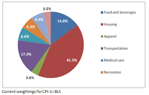
- These representative market baskets were developed from major surveys of thousands of consumers–the last ones back in 2007 and 2008. Detailed diaries and interviews were used to determine the content and relative weighting of the over 200 subgroups. The relative weightings allow the BLS to get compute the index, which is a weighted average of all the items measured. This weighted average may be a good representation of the average consumer, but your individual market basket is undoubtedly very different. The current relative weightings of the eight major expenditure groups are shown below.
But wait, that’s not all. You may not have realized there isn’t just one CPI number–that would be too simple. There are actually a number of Consumer Price Indexes calculated. These indexes are calculated regionally, then averaged for the country. Also, the indexes are published in both seasonally adjusted and unadjusted form. If you are making any decisions from this data, you want to be careful to understand what you are looking at. Below are the key indexes you likely will see quoted in different contexts.
- CPI-W: The CPI for Urban Wage Earners and Clerical Workers, a collection of households that represent only about 32% of the population. This is an older index with a limited subset of households (wage earners and clerical workers), but is important because it is the one used by the government to adjust Social Security payments on an annual basis.
- CPI-U: The CPI for All Urban Consumers, which covers about 87% of the total US population. This is a superset of the CPI-W, adding many additional categories of workers (e.g. the self employed and professional, managerial, and technical workers), along with the unemployed and retirees. (It is interesting to note that SS payments are adjusted by an index that excludes retirees, the CPI-W. I’m sure this makes sense to someone in the government.)
- C-CPI-U: Chained CPI for All Urban Consumers which covers the same set of households as the CPI-U, but uses a different methodology that attempts to reflect substitutions and adjustments consumers make as prices change. There are serious discussions underway to use the C-CPI-U to base adjustments to Social Security benefits, government and military pensions, and tax brackets. The chained CPU approach results in a lower inflation adjustment, and thus would lower government payments over time, along with potentially securing more revenue through slow, stealthy tax increases. (Needless to say, not everyone is a fan of this idea. More on that later.)
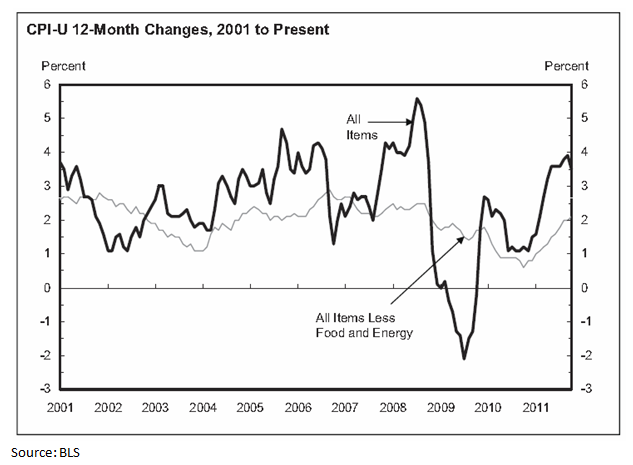
- Core CPI: This is an inflation measure that removes the effect of the volatile food and energy components of the CPI. Since food and energy account for close to 25% of the CPI, and often have major short term swings, removing these items results in a major smoothing of the curve, and helps economists observe inflation over the remainder of the economy. The Federal Reserve pays close attention to this number in its role of keeping inflation within desired bounds. The core CPI is often contrasted with the “headline” CPI, or CPI-U. When you hear an inflation number that is totally out-of-sync with what you are experiencing, listen carefully. It is probably the Core CPI that is being quoted.
- CPI-E: This is a CPI measure the attempts to reflect the different “market basket” or spending habits of the elderly. It is an experimental BLS inflation statistic, and you probably haven’t heard much about it. However, senior advocates would like the concept to catch on. The argument is that certain categories that older Americans spend more money on, especially healthcare, are underrepresented by the CPI-W. If Social Security was indexed to the CPI-E, cost-of-living increases would, in theory, better represent what seniors experience. And, more importantly, benefits would be presumably higher.
A couple of key points about inflation should be obvious by now. First, it is impossible to get an exact read on what inflation really is. The BLS goes to great effort, and probably does a superb job, but like most statistics about the economy it is an elaborate estimate that takes on the cloak of accuracy. Second, no CPI is going to measure your exact experience with price increases. You experience somewhat different inflation than your next door neighbor (the one drinking light beer while you sip your microbrew), not to mention the retiree in Florida, the oil worker in North Dakota, or the single mother in New Jersey.
What may not be obvious from all of this is the government conspiracy that is currently gaming the inflation numbers. (Yes, this is playing to the local crowd, but the best way to get Idaho readers to continue to the next post is to mention a government conspiracy or complain about the BCS. You get both in Part 3.)

